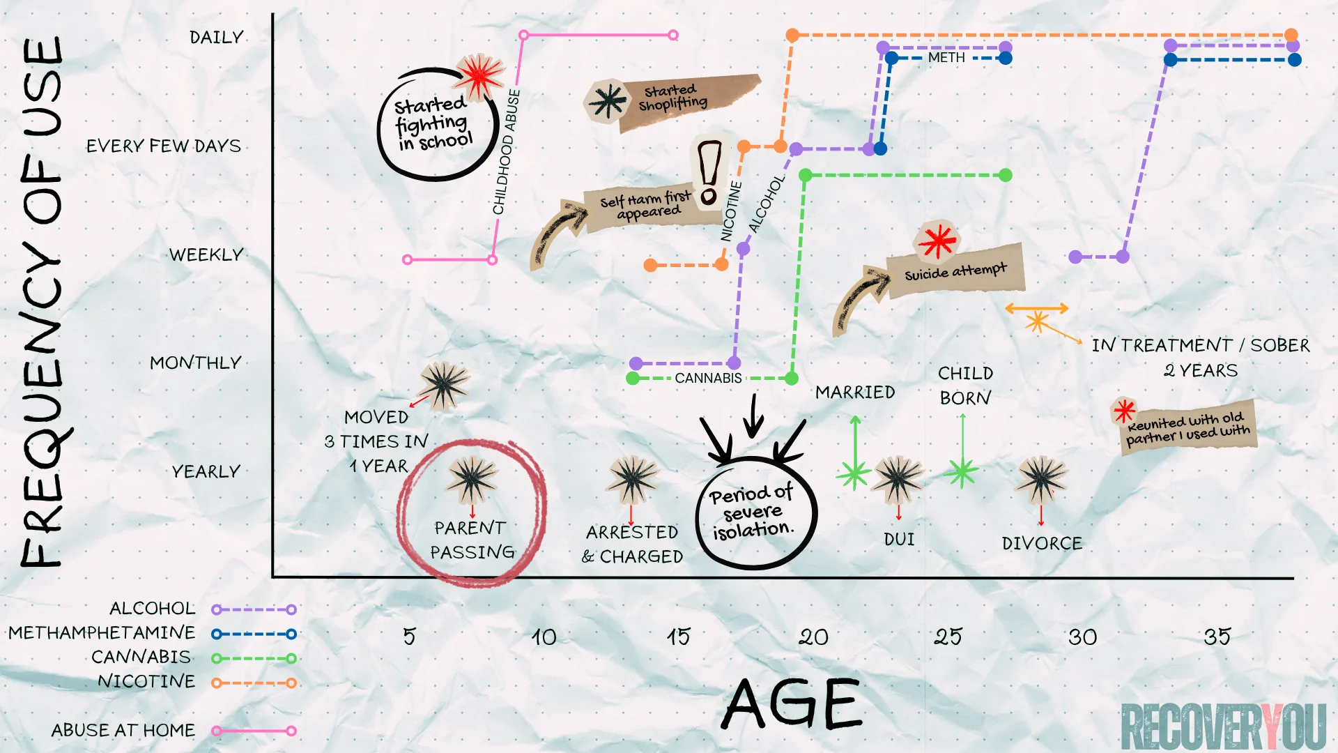
// The Exercise: Plotting Your Story
This exercise turns your personal history into a visual map. You'll need graph paper (or the printable PDF below), a pen, and a few different coloured markers or highlighters. Two axes: the X-axis (horizontal) represents your age, from early childhood to now. The Y-axis (vertical) represents frequency or intensity of use or behaviour, from "none" at the bottom to "constant" at the top. Don't get hung up on exact dates or precise numbers. Approximate honestly. The goal isn't accuracy for its own sake — it's pattern recognition.
What you're doing here is converting chaos into clarity. When patterns take shape on paper, they stop feeling random — and start feeling understandable.
You'll layer several categories on the same chart:
- Primary Addictions: In one colour, draw a line for each primary substance — alcohol, stimulants, opioids, whatever applies. Plot when it began and how frequency or intensity shifted over time.
- Cross-Addictions: In different colours, layer in other compulsive behaviours: nicotine, gambling, workaholism, food, sex, gaming, screens. Anything that became part of how you coped.
- Significant Life Events: Mark meaningful moments with a dot or symbol — the painful ones and the positive ones. A divorce, a death, a move, a breakup, a new relationship, a loss of any kind.
- Periods of Trauma: For ongoing difficulties — childhood neglect, abuse, a toxic relationship — draw a shaded or continuous line across the duration. This makes the weight of long-term stress visible in a way that single events don't capture.
- Behavioural Patterns: In another colour, track the frequency of key survival behaviours. Not flaws — adaptive strategies you developed to manage pain. Lying, people-pleasing, isolation, control, self-sabotage. These patterns often predate substance use by years and show exactly where your coping system first took shape.
- Sobriety and Relapse: Mark periods of sobriety clearly, and note when relapses occurred. No judgment — just data.
Below is a fictional example of what a completed chart might look like. Fill it out in whatever way works best for you — these are guidelines, not rules. If something feels relevant, put it in, even if you're not sure why. Sometimes the connection only becomes visible once it's on the page.
// What You'll Likely Notice
W hen I completed my chart in treatment, the first thing that hit me was how almost every spike in use lined up with a life event. I already knew about each event. I already knew about each escalation. But seeing them overlap on paper made the connection impossible to ignore. It was painful — and strangely relieving — because it meant there was usually a reason. A driver. Not an excuse, but a cause. Some fluctuations didn't have a clear explanation, which probably came down to memory gaps, missing context, or the fog that comes with years of use. That was fine. Perfect accuracy was never the point. Honesty was.
When I added the cross-addictions, the picture got sharper. I could see my brain doing what it had always done — reaching for something, anything, whenever life became too much to sit with. But what shifted everything was tracking the behavioural patterns. Not the substances. The behaviours. One of the lines I charted was lying and manipulation — something I'd always blamed on the addiction. I assumed it started with using. But the further I sat with the chart, the further back that line went. It didn't start with addiction. It started in childhood. It formed in survival. That realisation was uncomfortable. It was also the most clarifying thing I'd seen in years.
Maybe your chart tells a similar story. Maybe it reveals something entirely different. Maybe you won't see any clear pattern at first — and if that's where you land, take a long honest look at everything you've mapped and recognize it for what it is: a record of what you've carried. The good, the devastating, and the ugly-as-hell. And yet here you are, still in it. Either way, the data tells the truth. And truth is where understanding starts.